We live in a great era for kart data analysis. Download a session file, open it in any analysis software, press compare, and you can say with certainty where you gained and lost against the previous run.
Whether your braking improved in turn one after changing your line. Whether that engine you just tried is stronger at the bottom or the top of the range, just by overlaying delta time, speed and RPM.
And yet most drivers I work with at race weekends use maybe ten percent of this. They scroll laps, nod at the screen, and go drive the same mistakes again.
The gap isn’t software knowledge. It’s not having a method. This article is the method, the same one I run with drivers after every session, and it takes about twenty minutes.

Before the session: decide the question
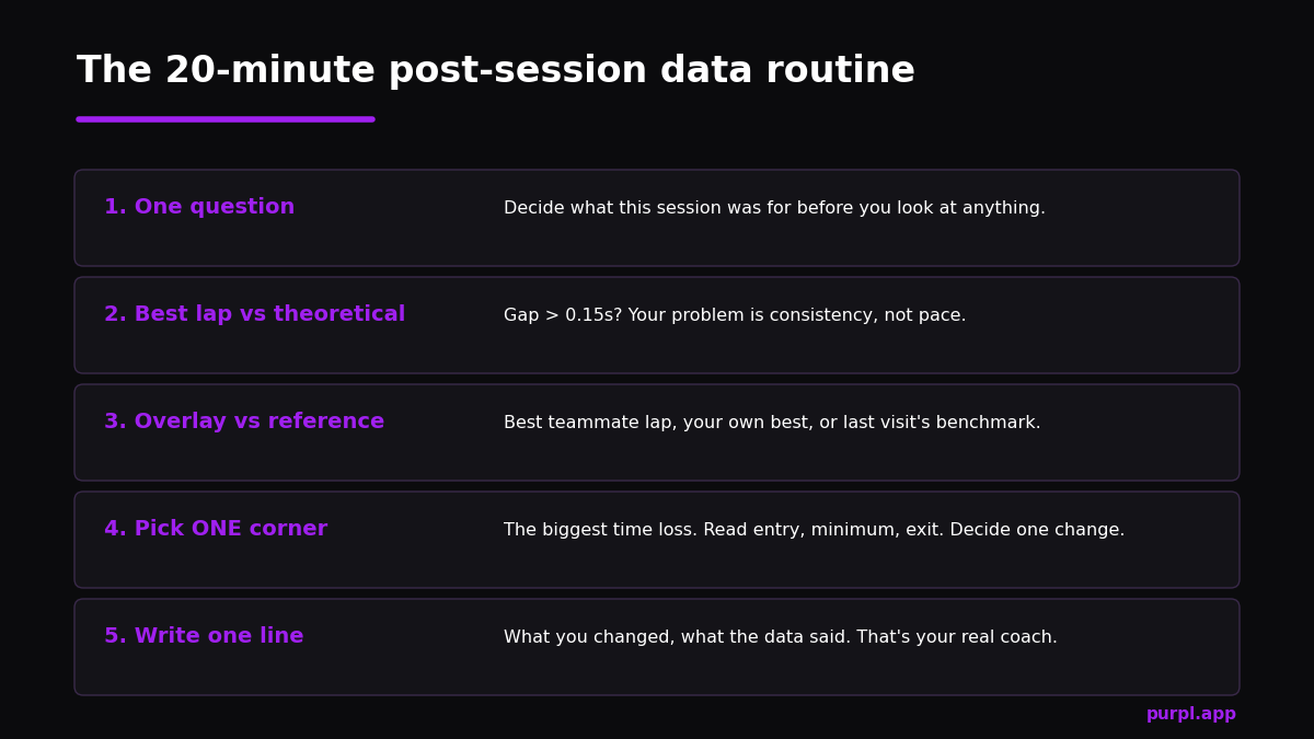
Analysis starts before you put your helmet on. Pick one question the session must answer.
Am I losing the chicane on entry or exit? Does the new sprocket hurt me out of the hairpin? Is my lap one pace close to my lap five pace?
One question. Not five.
A session driven to answer a question produces data worth reading. A session of random pushing produces a diary, and diaries don’t make you faster.
This sounds like discipline for its own sake; it isn’t. The question decides which laps you’ll drive back-to-back, which references you’ll need, and whether the session is comparable at all once grip changes.
Step 1: open the lap times, but read them like an engineer
First look is always the lap list. Not to admire the best lap.
You’re reading the shape of the session: how big is the spread between your fastest and your average? Did pace build as rubber went down, or did you peak on lap four and slide backwards as tyres went off?
Then check the number most drivers ignore: the gap between your best lap and your theoretical best, the lap your software builds from your fastest sectors. If that gap is more than a tenth, you have a consistency problem before you have a pace problem. I’ve written a whole piece on lap time analysis about exactly this.
Step 2: overlay two laps
This is the heart of all of it. Take your best lap and put a reference on top: your teammate’s quicker lap, your own best from the morning, or last visit’s benchmark. Set the chart to speed against distance and look for the places where the two lines separate.
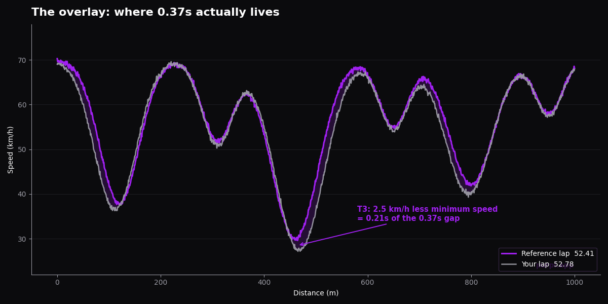
Three separations matter, in this order:
- Different valley floors. Your minimum corner speed is lower. In karting this is usually the whole story. A reference lap carrying 2.5 km/h more through one slow corner can account for two tenths on its own.
- Different tip-over points. You braked earlier, or the shape of your deceleration is lazier. Entry differences often cause the minimum-speed differences, which is why I treat braking technique as a data subject, not just a feel subject.
- Different climb rates. Same minimum, slower build to full speed: that’s an exit problem. Line, kart balance, or a short-shift of focus right when the corner pays you back.
If the software shows cumulative delta time, run it under the speed chart. It converts every separation into seconds, so you stop arguing about feel and start ranking corners by cost. I’ve explained that channel properly in the delta time guide, and the overlay technique itself has a deeper walkthrough in how to compare two laps.
Step 3: pick one corner. Only one.
Rank the losses. Take the biggest. Ignore the rest.
I’m strict about this with every driver I coach. Because the alternative is the classic data trap: leaving the tent with six corrections in your head and applying none of them properly.
For the chosen corner, zoom in and read it like a sentence: where did braking start, how hard, what was the minimum, where did acceleration begin.
Write down the one change you’ll make. “Brake at the second kerb joint instead of the first, accept more entry speed, stop steering twice.” Specific enough that the next download can prove or disprove it.
Add RPM to the picture
Speed against distance answers most questions, but some lies only show up when you put the RPM trace underneath it.
A corner where your speed matches the reference but your revs sag on exit points at gearing or carburation, not driving. Revs that hit the limiter two hundred metres before the end of the straight mean the sprocket choice is throwing away free speed. And no amount of technique work will find what the gearing already lost.
The combination also catches a classic kart problem. Clutch slip. Speed flat, revs spiking on corner exit, that’s the clutch eating your acceleration, and it’s invisible in the speed trace alone.
Two minutes with both channels open saves an afternoon of blaming yourself for a mechanical problem, and the full channel pairing method is in reading kart RPM data.
My rule for which channels deserve your attention, in order: speed, delta time, RPM, then temperatures only as health checks. Everything else is garnish until those four are routine.
When the data and your feeling disagree
It will happen this week if it hasn’t already. You were certain the kart was faster through the esses on the new pressures, and the data shows you two tenths slower there. Sit with that discomfort, because it’s the most valuable moment in the whole process.
Nine times out of ten the feeling tracked something real but irrelevant: the kart felt faster because it slid less, moved around less, demanded less of you.
Comfortable and fast are different things, and drivers chronically vote for comfortable. This is why I insist the data gets the verdict and feel only gets a vote. Not because feel is worthless, but because feel measures effort, and the stopwatch measures speed.
The tenth time, the data really is wrong: a GPS glitch, a beacon misread, an out-lap polluting the comparison. You learn to spot these quickly, implausible spikes, a sector that “improved” by half a second with no driving change, and the sanity checks are part of understanding GPS accuracy.
Trust the data. But check its alibi.
Step 4: close the loop next session
Back on track, drive the change. Back in the tent, download and check that one corner first, before anything else tempts you.
Did the valley floor come up? Did the delta in that sector shrink?
If yes, lock it in and pick the next corner. If no, the data just saved you a week of practising the wrong fix.
That loop, question, data, one change, data again, is the entire job. Champions just run it more times, with fewer excuses.
A worked example of how concrete this should be. Saturday morning, the question was T3 entry. Download shows minimum speed 31.5 km/h against the reference’s 34.
Change: brake at the end of the kerb instead of the marshal post, carry the brake lighter and longer. Next session: minimum 33.2, delta in that sector down from 0.21 to 0.08. Corner closed, next corner opened.
That’s what a productive Saturday reads like in the notebook. None of it requires talent, only the discipline to do one thing at a time.
Step 5: one line in the notebook
Finish every analysis with a single written line: what you changed, what the data said, what’s next.
Six months of those lines beats any single brilliant afternoon of chart-reading, and it’s the raw material for spotting your patterns, the corners and conditions where you always bleed time. My full debrief structure, with a template you can print, is in how to run a post-session debrief.
Build a reference library
Single-session analysis answers today’s question. The compounding returns come from what you keep. Three things belong in your permanent library.
Golden laps: your best clean lap at each track you visit, saved and labelled with conditions. Next visit, that’s your day-one benchmark, and your warm-up session immediately becomes a measured session instead of a vibe check.
Teammate references: any time a faster driver in identical equipment lets you have their session file, treasure it. Their braking points and minimum speeds are a map of what your kart can demonstrably do. Mine them corner by corner, with the caveat from earlier: copy the destination, not the journey, or you’ll build the data dependence I keep warning about.
Condition pairs: the same track in cold and hot, green and rubbered, wet and dry. After a season you’ll have a private textbook of how lap time behaves at your home circuit under every sky, and you’ll stop being surprised by Sunday.
Race data deserves its own shelf. Practice laps are clean experiments; race laps are contaminated by traffic, defence and tyre life, and that contamination is exactly what makes them interesting.
Your average lap in a final, and how it degrades stint over stint, predicts your race results far better than your qualifying heroics do. Check both. But know which question each answers.
The warning that comes with all this
Now the part where I argue with my own article. Data analysis is backward-looking. It describes a session that already happened, on grip that no longer exists, and it cannot predict the driving the next session will need.
Used wrong, it makes you lazy. I see it constantly at international weekends: a driver who waits for a teammate to find the braking points, then copies them from the overlay.
It works, right up until there’s no teammate lap to steal. Then the driver is lost, because the data replaced the skill of feeling the limit instead of sharpening it. Some of these kids are seven metres off an optimal braking point in a hairpin and genuinely cannot find those metres without the chart.
So treat every overlay as a question about your own perception: I felt X, the data says Y, why? That habit builds what I call a mental simulator, the internal model that lets you predict lap time while you’re still in the corner.
The data calibrates the simulator. It must never become the simulator. The same principle is why I tell drivers to stop staring at the dash mid-session, which I covered in the karting telemetry guide.
Common analysis mistakes
The five I correct most often, fully expanded in data analysis mistakes.
- Comparing laps from different grip eras of the day and drawing line conclusions from what was really track evolution.
- Chasing top speed differences that are actually exit differences three corners earlier.
- Trusting a wounded sensor. Check plausibility before conclusions: a GPS glitch reads exactly like a heroic apex.
- Analysing ten corners and fixing none.
- Skipping sector analysis entirely and judging whole laps, which hides where the story lives.
FAQ
What software do I need for kart data analysis?
Whatever came with your logger is enough to start: every major package does overlays, deltas and sectors. The method in this article is software-agnostic.
AI tools, including what we’re building at Purpl, automate the ranking-corners step, but the loop stays the same. For the manual route, the community walkthroughs on TKART are solid.
How long should data analysis take?
Twenty minutes per session is the target. If it’s taking an hour you’re reading charts without a question, and if it’s taking two minutes you’re admiring lap times. Set a timer at first; the discipline matters more than the software.
Should I analyze every session?
Every session you drove with a question, yes, even briefly. The exception is pure fun runs and the first laps at a new track, where seat time and observation beat charts. Practice without review is half-priced practice, a point the coaches on KartPulse make weekly.
Alessio Lorandi started karting at six and won the 2013 CIK-FIA Karting World Championship. He raced through Formula 3, GP3 and Formula 2 before founding Purpl, an AI data coach for karting drivers.
Leave a Reply