Category: Uncategorized

  • How to Measure (and Fix) Lap-to-Lap Consistency

    How to Measure (and Fix) Lap-to-Lap Consistency

    Ask me what separates a quick kid from a racer and I’ll give you the same three words every time. Consistency, consistency, consistency.

    Setting one quick lap is the easy half of the sport. The difficulty is repeating that lap over and over, and lap consistency in karting is brutally measurable, which is why so few drivers measure it. The number doesn’t flatter anyone.

    Here’s how to compute yours, what it predicts, and how to make it better.

    Lap consistency karting guide cover with purple lap time distribution on black

    The standard I hold drivers to

    My rule comes straight from my own career, and I’m pretty brutal about it. If you can’t keep your pace within one tenth of your fastest lap, we have a problem.

    I apply it to myself the same way. If I can only put three or four laps within a tenth of my best, I’m not being good enough. That’s it. No drama, just “you’re not doing a good job, man”, and back to work.

    I always like to say that the consistency of a driver over twenty laps is an index of how good the driver is. Speed impresses in qualifying. The twenty-lap index wins on Sunday.

    Twenty laps, one tenth, no excuses.

    How to measure lap consistency in karting

    Three numbers, all computable in your analysis software or a spreadsheet in five minutes.

    Three lap time variation metrics for karting: window count, spread and standard deviation

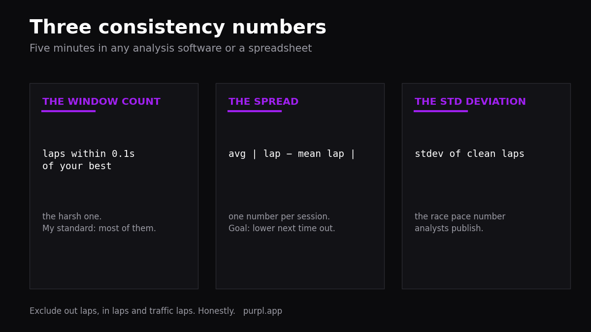
    The window count. How many laps landed within one tenth of your best? Simple, harsh, and the one I check first. Out laps, in laps and traffic laps don’t count, in either direction.

    The spread. Average gap between each lap and your session mean. I used to compute exactly this from printed rental-kart timesheets in a spreadsheet, and the goal each visit was just to bring the number down. It’s channel five in my math channels starter pack.

    The standard deviation. The statistician’s version of the spread, and what the data world uses for race pace. F1 analysts publish whole seasons this way, lap time distributions instead of best laps, and a site like F1 Pace shows how revealing the picture is. A tight distribution is a racer. A wide one with one heroic outlier is a qualifier with homework.

    Don’t overthink which metric to adopt. All three move together, so pick one, write it down every session, and stop changing the ruler. Numbers without dates are just trivia.

    Count the laps that count

    One refinement before you trust your numbers. Not all laps are made equal.

    Twenty laps of committed, on-the-limit driving build something. Twenty laps of cruising produce a gorgeous spread and teach you nothing, because consistency at eighty percent effort is just repetition. The quality of the lap multiplies the value of the lap, in practice and in the numbers.

    So pair the spread with intent. A tight spread at full commitment is the racer’s number. A tight spread built on safety margins is a parked handbrake pretending to be a skill.

    What consistency actually predicts

    Why obsess over this number instead of outright pace? Because of what each one buys.

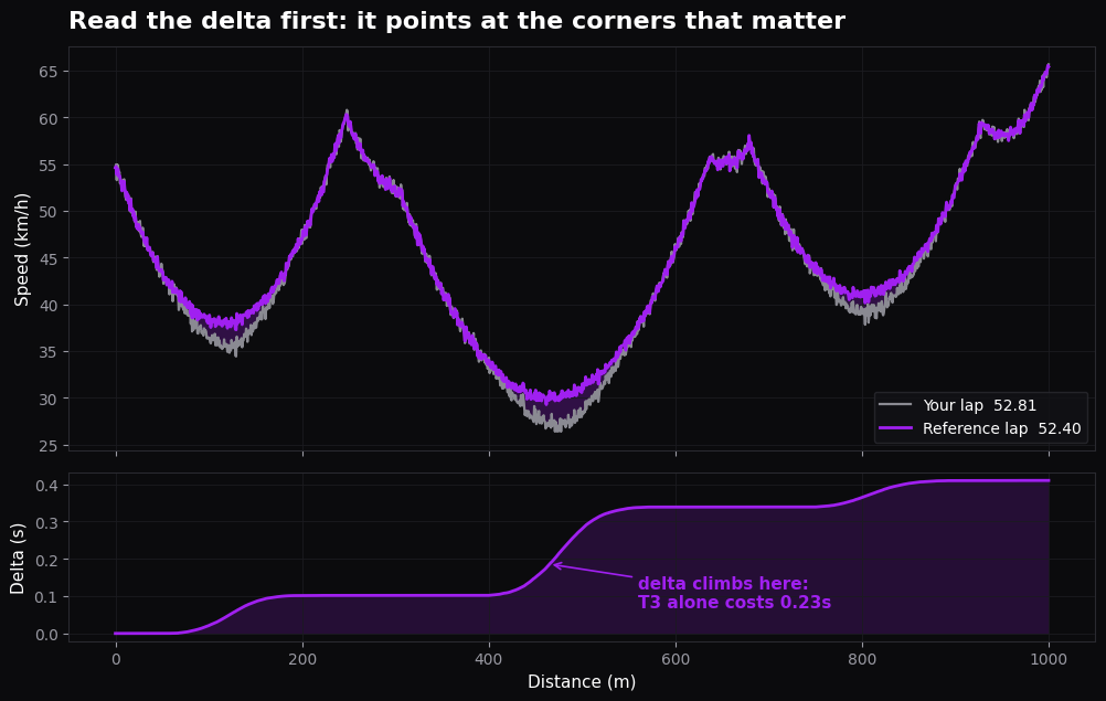
    Pace buys you a grid slot. Consistency buys you everything after the start: defending without mistakes, attacking lap after lap, surviving the moment the tyres go off. In a 25-lap final, the driver lapping two tenths slower but every single lap beats the hero whose pace comes and goes. The arithmetic of that is in delta time, and it’s merciless.

    The people whose job is finding talent know this. When teams and managers scout drivers, they don’t stop at results. They go through live timing and past races to check whether the good laps repeat, or whether the results were one-shots and mere luck. Enthusiast analysts do the same with race lap tables, the Clip The Apex lap analysis thread being a long-running example. Your spread is being read by people you’ve never met.

    Where the variation comes from

    Before fixing consistency, split it into its three sources, because each one has a different cure.

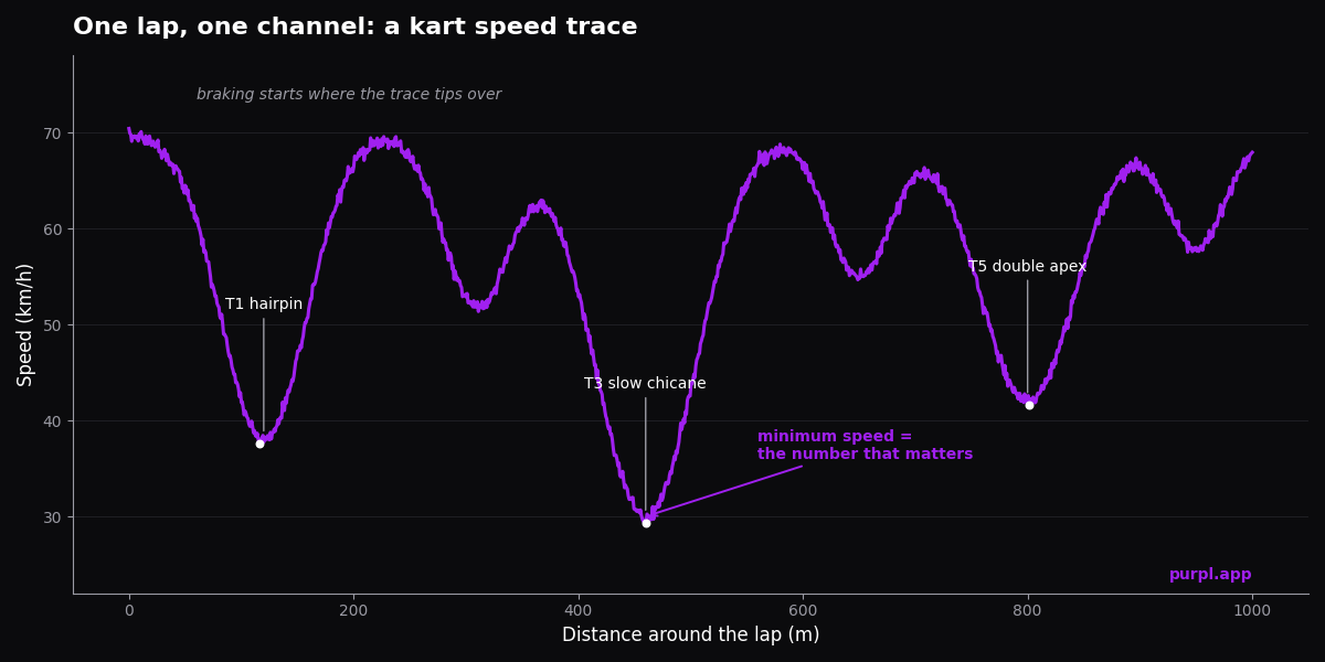
    The track. Grip rises as rubber goes down, so some lap-to-lap drift is physics, not driving. Judge your variation against the session’s trend line, not against a flat ruler. The method for separating the two is in track grip evolution.

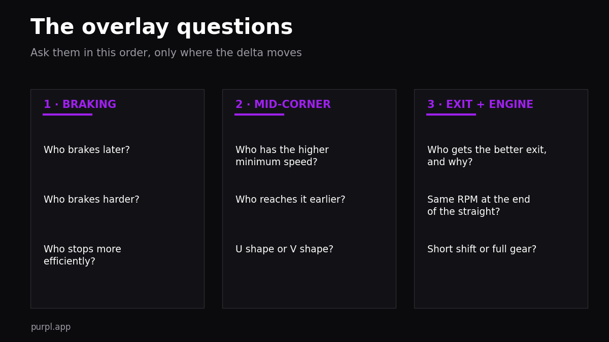
    The driver’s hands. Wandering braking points, lines that change for no reason, a kerb taken on some laps and not others. This is the bucket data fixes best, one corner at a time, through sector analysis.

    The driver’s head and body. Focus fades, and it fades on a schedule. Compare your lap times before and after lunch some race day. A heavy plate of pasta and your afternoon laps lose the precision the morning ones had, which is why I eat small and often at the track instead. Unglamorous, measurable, real.

    Split the stint in two

    One more measurement habit. Compute your numbers twice: laps one to three, and everything after.

    Opening laps on cold tyres, in traffic, with everyone sliding around in search of grip, will always be your widest. That part is racing, not inconsistency. The number that should be tight is everything after the tyres come in.

    If the spread stays wide after lap three, now you have a real driving project. And if only the opening laps are wide, your project is warm-up and racecraft, which is different homework entirely.

    Cold tyres tell their own story in the data, and it’s a setup story as much as a driving one, the trade covered in kart tire pressure.

    The fix: turn unforced errors into overpushing errors

    Here’s the reframe that did the most for my own consistency.

    There are two kinds of mistakes. Unforced errors, where you miss an apex for no reason on a lap you weren’t even pushing. And overpushing errors, where you asked the kart for two percent more than it had. Most drivers’ inconsistency is unforced, and that’s good news, because unforced errors are a focus problem, not a talent problem.

    So put in the effort to translate your unforced errors into overpushing ones. Push to the limit deliberately, every lap, and you’ll find the limit faster, improve your accuracy, and become both quicker and more consistent at once. Cruising doesn’t protect your lap time. It just makes the mistakes boring.

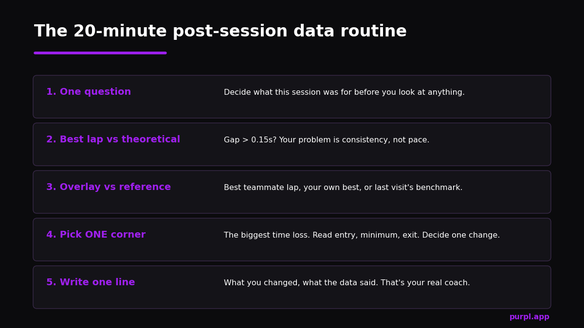
    Then work the loop. Find the corner with the biggest lap-to-lap variation, decide one reference to lock down, drive a session where your only job is hitting it every lap. The full version of that loop is my data analysis routine.

    A session plan that builds the skill

    Consistency trains like fitness: specific sessions, measurable result.

    Once a test day, run a twenty-lap stint with no lap time on the dash. Just drive references. Afterwards, compute the window count and the spread, and write both in the notebook next to the conditions. Rental karts work beautifully for this too, the printed timesheet is the whole exercise, and the tight walls punish imprecision honestly.

    Across a season those notebook lines become a curve. The curve is your real progress, far more than the PB list, and it’s the number I’d show a team manager before any pole position. Once a season, do the full audit too: pull every race lap by lap and compute the spread for each in one evening. The trend across races tells you more about your trajectory than any championship table, because points reward circumstances while the spread rewards only you. I still run this on myself, by the way.

    When the curve flattens, the next tenth is usually mental, which is a subject of its own in confidence and data.

    FAQ

    What’s a good consistency number for a club driver?

    From experience: at club level, half your clean laps inside two tenths of your best is solid, and inside one tenth is the standard I push serious drivers toward. At international level the front runners live inside a tenth for full stints. Measure against your own last month first. And log the conditions next to the number, because a tight spread on a green Monday is a different achievement from one in a rubbered final.

    Should I exclude traffic laps from the calculation?

    Yes, and out laps, in laps and obvious incident laps too. Consistency measures your driving, not your luck. But be honest with the cut: if “traffic” removes a third of your laps every session, your racecraft in traffic is the inconsistency.

    Is consistency more important than raw pace?

    They’re stages, not rivals. Pace without consistency wins nothing on Sunday; consistency without pace defends midfield forever. Build repeatability at your current speed, then raise the speed and rebuild it. That ladder, repeated, is a karting career.

    Which tool computes this for me?

    Any analysis package will give you mean and standard deviation per session, and a spreadsheet does it from a pasted column of lap times. The exact formulas are in the consistency-spread section of math channels.


    Alessio Lorandi started karting at six and won the 2013 CIK-FIA Karting World Championship. He raced through Formula 3, GP3 and Formula 2 before founding Purpl, an AI data coach for karting drivers.

  • How to Read a Speed Trace (and Spot Time Left on Track)

    How to Read a Speed Trace (and Spot Time Left on Track)

    One graph holds more lap time than every other screen in your software. Speed on the vertical axis, distance on the horizontal. The speed trace.

    Most of the speed trace analysis I do with drivers comes down to reading that single line properly. A kart lap drawn this way becomes a row of valleys, and every valley is a corner with a verdict written inside it.

    Braked too early. Rolled enough speed. Killed the exit.

    Drivers stare at this graph for years without learning its grammar. This article is the grammar.

    How to read a speed trace in karting, hero graphic with annotated purple speed graph

    What the graph actually shows

    Every kart data logger draws it the same way. The line climbs on the straights, tips over when you brake, falls to a low point somewhere in the corner, then climbs again.

    Valleys and plateaus. A 52-second lap at most kart tracks contains eight to twelve valleys, and your job is to learn what a healthy one looks like.

    One setting before anything else: put distance on the horizontal axis, not time. On a time axis, slow sections stretch and fast sections compress, and nothing lines up when you compare laps. On a distance axis, every point on the graph is a physical metre of track.

    The longtime F1 technical analyst Craig Scarborough wrote a good introduction to reading race telemetry years ago, and it starts from exactly this convention. Karting inherited it for the same reason.

    Each valley then has three regions, worth reading in order: the entry wall, the floor, and the exit slope.

    Speed trace analysis of one karting corner showing braking point, minimum speed and exit slope

    The entry wall: where and how the line falls

    The point where the trace tips over is your braking point. Fixed in metres, no opinion attached. That alone settles half the arguments in a race tent.

    But the shape of the fall matters as much as where it starts.

    A good braking zone in a kart drops steeply at first, while the tyres have all the load, and then softens as you bleed toward the apex. On the graph that’s a wall leaning progressively into a curve.

    When I see the opposite, a long lazy ramp, I know the driver braked early and gently. He carried the brakes like a passenger instead of using them.

    Two drivers can start braking at the same metre and arrive at the apex three tenths apart, purely on the steepness of that wall. That’s deceleration efficiency. It’s the heart of karting braking technique.

    Watch for the double dip too. The trace falls, flattens briefly, then falls again. That’s a driver who released the brakes, didn’t like what he felt, and grabbed them a second time.

    It almost always means the first braking point was fine and the commitment wasn’t. The cure lives in trail braking, not in braking earlier.

    Speed trace analysis at the floor: minimum speed

    The bottom of the valley is the number that matters most. In equal machinery, minimum speed explains most of the gap between two karting drivers. Karts have no suspension to hide mid-corner speed and very little to gain from hero braking, so the driver who keeps the floor higher is nearly always the faster one.

    But height is only half the reading. The other half is position: where along the corner the minimum happens.

    When I compare drivers I ask two questions of every floor. Who has the higher minimum speed? And who reaches their minimum earlier?

    An early minimum means the rotation is done and the steering is already opening, so the whole exit happens on a loaded rear axle with the engine pulling. A late minimum means the driver was still slowing the kart in the middle of the corner, and everything after it is recovery.

    Danilo Rossi, five times world karting champion, insists you can’t win titles without a strong front end. This is exactly why. Front grip rotates the kart sooner, pulls the minimum earlier in the corner, and lifts it at the same time.

    The trade is a more nervous entry. Data shows you whether the trade is paying.

    There’s an engine reason to obsess over the floor as well. Drop a couple of hundred RPM below the happy zone mid-corner and a kart engine bogs on exit. The trace shows it as a valley floor scraping too low, followed by a slope that can’t climb.

    Line choice feeds this directly. Using all the track makes a corner rounder and the minimum higher, which is why the racing line and the speed trace are really one subject. Gearing feeds it too, since a longer gear ratio punishes a low minimum twice as hard.

    As a kid I trained with sprockets one or two teeth longer than optimal, precisely to force myself into higher minimum speeds. Brutal exercise. It works.

    U shapes and V shapes

    Two fast drivers can produce different valley shapes through the same corner. A U shape rolls speed: earlier off the brakes, higher floor, patient throttle. A V shape stops and fires: deeper braking, lower floor for less time, hard on the power.

    Neither is universally right. Which is a sentence most data guides won’t commit to.

    U shape versus V shape corner on a karting speed graph comparing rolling speed and stop-and-go styles

    The kart decides. A low-powered single-gear kart, a 60 Mini or an OK-Junior, lives and dies on momentum. It almost always wants the U, because the engine can’t repay a stopped corner.

    A KZ shifter with six gears and real torque can afford a V where the corner rewards it. Usually that’s a hairpin onto a long straight, where exit direction matters more than carried speed.

    When your reference driver is quicker through a corner, the shape of his valley tells you how he’s doing it. Rolling speed or rotation? Two completely different homework assignments.

    The shape question is one of the first things I check in an overlay comparison.

    The exit slope: where the straight is built

    From the floor of the valley, the line climbs. The angle of that climb is your exit. Small differences here compound for the entire straight that follows, because a deficit at the corner exit is still there 150 metres later at the braking board.

    A healthy exit slope is clean and unbroken. One continuous acceleration from minimum speed to the next braking point.

    The two sick versions are easy to spot. A slope that starts late means the driver parked the kart mid-corner and lost the engine. A slope with a step in it means wheelspin, a slide, or a lift.

    On a single-gear kart that step usually means the exit line pinched until the engine fell off its power band.

    One warning from years of doing this with kids and adults alike. The earliest throttle application is not automatically the best one.

    I see drivers proudly point at the data showing they touched the throttle before their teammate. Meanwhile their slope climbs slower, because the kart was still sliding and the engine was dragging against a scrubbing rear axle.

    Read the slope, not the pedal. Where the speed actually builds is the truth. The full picture needs the throttle channel beside it, which I cover in throttle trace analysis, and the technique behind a strong exit lives in corner exit speed.

    The plateaus: read with suspicion

    Straight-line speed is the most over-blamed number in karting. A driver sees 1.5 km/h missing at the end of the straight and concludes the engine is down on power.

    Then you check the reference lap. The other kart was towed along in someone’s slipstream. Or it simply exited the previous corner 2 km/h faster and held that advantage the whole way down.

    So before any conclusion about engines or carburetion, trace the plateau backwards to the valley that launched it. In my experience most “engine” deficits on the straights are exit deficits wearing a disguise. Almost every time.

    The data engineer Samir Abid has a good piece on relating telemetry to track performance that makes the same point from the car-racing side. Channels lie when you read them in isolation.

    A routine that takes ten minutes

    Here’s how this becomes practice rather than theory. After each session, open your fastest lap and walk the valleys left to right.

    Three questions for each one.

    Did the line fall steeply from the right metre? Did the floor stay high and happen early? Did the slope climb clean?

    Mark the worst valley. That’s your project for the next session. One corner, one change.

    With a reference lap alongside, the same walk turns into the full detective routine I described in the lap comparison guide above. The delta channel will point you to the valley that matters most.

    Without any reference, the shapes alone still talk. A lazy entry wall, a scraping floor, a broken slope. Each one is lap time with an address.

    Twenty sessions of this and you’ll glance at a speed graph the way you glance at a corner. Instantly, and without translating. That’s when the tool starts paying for itself, and it’s the foundation everything else in my karting telemetry guide builds on.

    FAQ

    Is a GPS-only logger enough for speed trace analysis?

    Yes. Braking points, minimum speeds, valley shapes and exit slopes all come from GPS speed alone, and that’s where most of the lap time hides.

    RPM adds the engine’s side of the story and is worth having. But I’d rather see a driver master the speed trace from a basic unit than skim six channels on a flagship one.

    What’s a good minimum speed for my corner?

    There’s no absolute number. It moves with grip, tyre, class and corner radius. That’s why minimum speed only means something against a reference: a faster teammate, your own best lap, or the same corner earlier in the day.

    Chase the comparison, not a magic figure.

    Why does my trace look ragged in slow corners?

    GPS speed gets noisy at hairpin pace, especially on 10 Hz units, and analysis software smooths it with varying success. Read slow-corner floors as a band rather than an exact value, and trust the shape more than the last decimal.

    If the whole lap looks ragged, check the antenna mounting before blaming the driving.

    Should I look at the speed trace or the delta first when comparing laps?

    Delta first, always. It tells you where the gap grows, then the speed trace tells you why. The pairing is the core of overlay work, and I’ve broken the delta side down separately in delta time telemetry.


    Alessio Lorandi started karting at six and won the 2013 CIK-FIA Karting World Championship. He raced through Formula 3, GP3 and Formula 2 before founding Purpl, an AI data coach for karting drivers.

  • How to Compare Two Laps: Overlay Analysis for Karting Drivers

    How to Compare Two Laps: Overlay Analysis for Karting Drivers

    At the 2018 Winter Cup I compared my data against my teammate’s every evening. He was half a tenth to a tenth faster than me in almost every session, and he knew it, which is why he never bothered opening my laps.

    I opened his every single time.

    When you compare laps in telemetry, you stop guessing where the time is and start reading it off a graph, corner by corner, with a number attached. By qualifying I knew exactly which corners were mine and which were his.

    He took pole out of 94 KZ2 drivers. I was second, 0.042 behind. Then I won the first three heats, including the one against him.

    That teammate, by the way, was my brother Leo. Which tells you something about how seriously I take a data comparison.

    Compare laps telemetry overlay analysis guide for karting drivers

    This article is the method behind that week. It assumes you know what a kart data logger records and that you’ve read a basic lap before. If not, start with my karting telemetry guide and come back.

    Why the overlay beats every other view

    A single lap of data tells you what happened. Two laps on top of each other tell you what’s possible.

    That difference is everything. Your braking point into turn three means nothing in isolation. But put it against a reference lap that goes four metres deeper and still makes the apex, and it becomes a measured, provable gap.

    You can go and close that gap in the very next session.

    Before telemetry existed, drivers relied on split times on the dash and their mechanic’s opinions. A mechanic watches you miss one apex and tells you to brake earlier, while the data shows you were braking too early on every other lap of the session.

    The overlay settles arguments like that in seconds. And it doesn’t care about anyone’s feelings.

    I’ve called this the closest thing to a legal shortcut that exists in karting. Your teammate spends thirty laps finding the limit somewhere. You download his file and “steal” the answer for free.

    Pick the reference lap first, and pick it carefully

    Every overlay is a comparison against something. And the something matters more than people think. A lot more.

    The default choice is the fastest lap available in your team from the same session. Same session matters. Grip in karting moves by whole tenths between a morning run and an afternoon run as rubber goes down.

    Compare across sessions and you mix driver differences with track differences until you can’t tell them apart. Telemetry is backward looking. It describes grip that no longer exists, which is exactly why you compare laps that lived on the same grip.

    Two traps to check before you trust a reference lap:

    • Was it done in a slipstream? A lap towed along a straight shows speed your engine cannot reproduce. I’ve watched drivers blame their engine for a 1.5 km/h straight-line deficit. Then they go quiet when I show them the reference driver was glued to someone’s rear bumper that lap.
    • Was it one hero lap or repeatable pace? A lap with one banzai corner teaches you less than a lap the driver can do ten times. Check his other laps before you copy anything.

    No teammate? Compare your best lap against your own theoretical best, the one your software stitches together from your fastest sectors. I wrote about that exercise in lap time analysis, and it’s the same overlay skill pointed at yourself.

    Set the axis to distance, not time

    One setting ruins more overlays than any other. Plot the laps against time and the slower lap takes longer to complete each section. The traces slide out of sync.

    By mid-lap you’re comparing your turn five with his turn six. Useless.

    Plot against distance instead. Every package does it, from Race Studio to Alfano’s software, usually in one dropdown, and then both laps sit on the same metre of track at every point.

    A vertical line through the chart means one physical place. Plain and simple. That’s the whole trick that makes overlays readable.

    The reading order when you compare laps in telemetry

    Opening every channel at once is how beginners drown. Three channels, read in a fixed order, find almost everything.

    Lap overlay analysis showing speed traces and delta time graph for two karting laps

    First: delta time. This is the line showing the running gap between the two laps. Where it’s flat, nothing is happening.

    Where it climbs, you’re losing time at that exact spot, so don’t read anything else until you’ve found the two or three places where the delta moves most. They are the lap.

    Everything else is detail, and I’ve covered the channel itself in delta time telemetry.

    Second: the speed trace, only at those spots. Now you ask the questions I run through every time I open a teammate’s file.

    Who brakes later? Who brakes harder? Who carries a higher minimum speed, and who reaches their minimum earlier?

    Who picks up a better exit, and why? If he’s faster through a corner, is his valley U-shaped (rolling speed) or V-shaped (stop and go)?

    Each answer points at a specific change in your driving. The full skill of reading that graph is its own article: how to read a speed trace.

    Third: RPM. Gearing and engine questions. Are you both pulling the same revs at the end of the straight?

    Does he short-shift where you hold the gear? In a hairpin, RPM also betrays how much speed each kart kept once GPS gets noisy at low speed. Only after these three do the temperature channels earn a look, and usually they just confirm what the driving channels already said.

    How precise does this get? Precise enough that TKART, the karting technical magazine, put the loss in a single first corner at about 0.15 seconds while walking through a two-driver overlay. One driver covered 43 metres between throttle release and full throttle; the other needed 78.

    That’s the resolution you’re working with. Metres and hundredths, not impressions. Their full walkthrough is worth your time once you’ve done a few overlays of your own.

    One corner at a time, detective hat on

    Checklist of questions for comparing laps in karting telemetry: braking, minimum speed, exit, RPM

    When I go through a comparison I feel like Sherlock Holmes. That’s the right energy for it. You’re not browsing, you’re investigating a specific loss.

    And the investigation ends with a verdict you can act on. Brake three metres later into turn four. Or stop pinching the exit of the last corner.

    Take the worst corner from the delta, work through the speed questions, decide one change. Then stop.

    The discipline of changing one thing per session is what separates drivers who improve from drivers who just collect data. It’s the backbone of my whole data analysis routine.

    There’s an opposite character to the detective, and I meet him at every race weekend. He opens the overlay wearing what I call the “excuses hat”. He finds the 100 RPM his engine gives up in the mid-range and ignores the four metres of braking he leaves on the table into the hairpin.

    He reads an EGT difference as proof his carburetion is wrong. But the lines split purely because he and the reference driver pick up the throttle at different points.

    Data is a mirror. Open it looking for reasons the kart is at fault and you’ll always find one, and you won’t get faster. If you’re not humble enough to look in that mirror properly, don’t bother downloading.

    What the overlay can’t do

    I owe you a warning along with my enthusiasm, because I’m a genuine evangelist for this tool and I’ve still seen it make drivers worse.

    Lean on the overlay too hard and it makes you “lazy”. I see it coaching young drivers at WSK weekends: kids who won’t commit to finding a braking point with their own feel. They’ve learned to wait for a teammate to find it first, then copy it off the screen.

    The comparison should calibrate your internal references, not replace them. The day the grip changes mid-session, and it always does, the file from an hour ago is history and your own judgement is all that’s left.

    That balance between data and feel starts long before the laptop opens, back at braking technique you can trust.

    And remember the comparison only describes the session that already happened. It won’t tell you how to drive the next one on a greener or rubbered-in track.

    It hands you hypotheses. The track grades them.

    The loop that actually builds speed

    Here’s the rhythm I push on every driver I work with. It’s the one I lived by the week I nearly beat my brother to that Winter Cup pole.

    Drive. Download. Compare. Repeat.

    Every session, no exceptions. Twenty minutes with the overlay before anyone discusses setup. Corner verdict, one change, back out.

    Across a race weekend that loop runs eight or ten times, and each pass is worth somewhere between nothing and two tenths. Most of my data-driven gains came exactly this way, in small certain bites rather than big revelations.

    Once the two-lap overlay feels natural, the same habit extends across the whole weekend. Start with sector analysis.

    FAQ

    Which lap should I compare against if I have no teammate?

    Your own theoretical best lap, built from your fastest sectors of the session. The gap between it and your best real lap is consistency. Closing it is usually worth more than chasing outright pace.

    Failing that, compare your best lap against your second-best. The differences between them show you which corners you don’t yet control.

    Should I overlay laps from different days?

    Only to study yourself, never to judge pace. Grip, temperature and engine condition move too much between days for the absolute numbers to mean anything.

    Shapes survive better than numbers. A braking shape or a line choice can still teach you something across days, but treat any speed difference with suspicion.

    How many laps should go into one overlay?

    Two. Three at the absolute most. Every analysis screen lets you stack more, and every extra trace makes the picture harder to read.

    The comparison you act on is always your lap against one reference, in one corner at a time.

    Does overlay analysis work with a basic GPS-only logger?

    Yes. Speed against distance plus a computed delta time channel covers most of the method in this article, though you give up the RPM questions and some braking detail.

    But braking points, minimum speeds and exit shapes are all in the GPS trace, and that’s where most of the lap time hides. The most common errors are the ones I cover in data analysis mistakes, and hardware is rarely one of them.


    Alessio Lorandi started karting at six and won the 2013 CIK-FIA Karting World Championship. He raced through Formula 3, GP3 and Formula 2 before founding Purpl, an AI data coach for karting drivers.

  • Lap Time Analysis: How to Find Exactly Where You’re Losing Time

    Lap Time Analysis: How to Find Exactly Where You’re Losing Time

    Every driver knows their best lap time. Almost none of them know where it came from, or why the other eleven laps of the session were slower. That difference is what lap time analysis is for, and it’s the most direct route from “I feel quick” to “I know which corner owes me two tenths”.

    I’ll give you the full method here, including an exercise I use that you’ve probably never been asked to do, and that nobody enjoys. It works anyway.

    Lap time analysis guide cover graphic with Purpl branding

    Start with the theoretical best

    Your analysis software builds it automatically. Take your fastest sector 1, fastest sector 2, fastest sector 3 from the session, and stitch them together. You get the lap you would have done if you’d driven your own best pieces in a single lap.

    Theoretical best lap built from fastest sectors compared with actual best lap

    Here’s the standard I hold drivers to, and yes, it’s strict. Be upset if your theoretical is more than a tenth faster than your actual best.

    A 0.32s gap is completely normal at club level. But it means you already drove every piece of a much faster lap and never assembled it.

    That’s not a speed problem. You’ve proven the speed. It’s a precision problem.

    When I was coming through the ranks I had a rule for myself about this, half joke and half not: ten push-ups for every tenth of gap to the theoretical.

    The point wasn’t fitness. The point was that the gap is yours, not the kart’s, not the engine’s, and it should sting a little.

    The exercise nobody does: sum the gaps

    Now the painful part. Don’t stop at comparing your best lap to the theoretical. Calculate the gap between the theoretical and every lap of the session, excluding the out-lap and lap one, and add them up.

    Bar chart of gap to theoretical best lap for eleven kart laps showing consistency spread

    Why do this to yourself? Because it kills excuses one by one.

    “I had to overtake” explains one slow lap, not nine. And while we’re there: the best drivers lose less than a tenth making a pass, ideally half.

    “The chassis was sliding and hard to drive”: could be. Who said it would be easy? The fastest setup is often the trickiest one to drive, so drive it.

    “I made a mistake on my best lap”: fine, that happens to everyone pushing properly. Did you also make a big mistake on all the other ten?

    You see where I’m going. A driver who is four tenths off the theoretical once had a moment. A driver who averages four tenths off across a session lacks laser-focused precision, and that was completely me at the start of my career too.

    You can do a corner fast. Doing it every lap, that’s the sport.

    Run the numbers on the session in the chart above and the scale of it lands properly. Eleven flying laps. An average gap of 0.59s to the theoretical.

    A total of six and a half seconds donated to imprecision in one twelve-minute session. Multiply by six sessions in a test day. Half a minute of pure, already-proven speed, given away.

    No engine upgrade on sale anywhere offers you thirty seconds.

    The number this exercise produces, total time donated to imprecision per session, is the single most honest metric of your driving I know. Track it across weekends the way you track lap times. The deeper measurement methods are in how to measure lap-to-lap consistency.

    Then go one level down: sectors

    A lap time is a story with the pages glued together. Sectors pull them apart. Three is what most timing systems give you.

    If your software lets you define your own splits, make each significant corner its own sector. Because averaging a strong chicane with a weak hairpin into one number is how problems hide. The mechanics are in sector and split analysis.

    Read sectors against two references.

    Against your own best: which sector is the unstable one, the one that swings lap to lap? That’s where your precision leaks.

    Against a faster driver: which sector holds the biggest gap? That’s where your pace leaks.

    Two different leaks, two different fixes. And confusing them wastes months.

    Pick the right reference for the job

    Every comparison needs a reference lap, and choosing it badly produces confident nonsense. Three references, three different questions.

    Your own best lap answers “where am I inconsistent”. It’s the gentlest reference and the right one for the sum-of-deltas work, because every difference it shows is by definition within your proven ability.

    A faster driver’s lap from the same session answers “where am I slow”. This is the harshest and most useful mirror, with one warning: only borrow what transfers.

    A driver ten kilos lighter or on fresher tyres will show differences that aren’t driving. Look for the corners where the gap is concentrated rather than spread evenly; concentrated gaps are technique, spread gaps are usually equipment or conditions.

    Your own benchmark from a previous visit answers “am I actually progressing”, so keep one golden session per track, best conditions, best form, and measure against it each visit. Track evolution muddies single-day comparisons, but season-over-season trends against your own benchmarks are the truest progress report you’ll get.

    Qualifying analysis is its own discipline

    Race sessions reward the consistency work above. Qualifying asks a different question: can you produce your peak in a narrow window, often on lap two or three when the tyre is at its best?

    So analyse your qualifying sessions separately. Check which lap of the run your best came on, and compare that against where the tyre peak actually was. A driver whose best lap consistently arrives two laps after the grip peak is leaving pole positions on the table out of caution.

    Then check lap one specifically. The time you need on the opening lap of a stint is free in races too, at starts and restarts. And the early-laps evidence below says almost everyone undervalues it.

    From sector to corner: the final zoom

    Once a sector is convicted, the speed trace tells you which corner did it and how. Overlay your fast and slow laps in that sector, look at where the lines split: braking point, minimum speed, or exit slope. The reading technique is its own discipline, covered in how to read a speed trace and the lap overlay guide.

    One pattern shows up so often it deserves its own mention: the time rarely disappears where you think it does. A driver feels slow on the straight and asks about engines.

    The trace shows something else: 3 km/h lost at the exit of the previous corner, carried the whole way down. Exit speed compounds. Corner exit speed explains why that number multiplies the way it does.

    The early laps tell you something too

    One more place to point the analysis: your first three laps. I learned this watching the 2012 Winter Cup at Lonato, more than a hundred drivers per category, everyone testing all January for it.

    One driver pulled a tenth to a tenth and a half per lap on the field, but only in the first nine or ten laps, then the gaps stabilised. Everyone around me reasoned about tyre pressures. It wasn’t tyre pressures.

    He was simply at one hundred percent from the moment the flag dropped while everyone else took three laps to believe the grip. That driver was Max Verstappen, and the following year the same script played out again.

    So when you analyse a session, compare your lap 2-3 pace to your peak pace. If you need five laps to reach a limit your data proves was available on lap two, that’s free time, in qualifying especially. And most drivers never even look for it.

    Race pace: the analysis that predicts results

    Everything so far measures one-lap speed. Races are won by a different number: average lap over a full distance, and how it decays.

    Pull your last final into the software and compute three things: your mean lap excluding lap one and any laps with contact or major traffic. Your spread, the gap between your fifth-best and your twentieth-best lap, tighter is better and champions are freakishly tight.

    And your decay, the trend of your lap times across the stint as tyres age and your concentration is taxed.

    Now compare those three against the driver who won. The common discovery is humbling. Similar best laps, completely different averages.

    A driver who qualifies two tenths behind you and beats you by four seconds in the final didn’t find pace on Sunday morning. He’s simply driving his theoretical more often than you are, which sends you right back to the sum-of-deltas exercise above.

    Qualifying speed gets the photographs. Average lap pays the championship points.

    Traps in the numbers

    Three ways lap time analysis lies to honest people.

    Track evolution: the session got faster underneath you, so your “improvement” from lap three to lap eleven might be rubber, not driving. Check whether the whole field’s times fell by the same margin.

    Traffic accounting: deleting laps you “had traffic” on requires honesty, a kart half a second ahead is traffic, a kart three seconds ahead is an excuse.

    And cherry-picked sectors: a theoretical built from sectors achieved under completely different fuel loads or tyre ages is an aspiration, not a target. Build it from a single session’s laps and it stays honest.

    The defence against all three is the same boring habit: log conditions with the laps, compare like with like, and let trends across multiple sessions outvote any single spectacular number.

    Make it a habit, not a project

    All of this fits in the twenty-minute routine from the data analysis method. Theoretical gap, sum of deltas, worst sector, one corner, one change.

    Write the line in the notebook. Repeat next session.

    The cadence that works: full analysis at the track between sessions, then a second fifteen-minute pass at home in the evening while the session is still fresh. The evening pass catches what the paddock rush misses, and it’s where the season-long patterns first show themselves. Sunday night with a coffee and the week’s deltas is worth more than most paid test days.

    Numbers you produce once are trivia. Numbers you track for a season are a coaching program. And the day a pattern jumps out of your own notes, you’ll understand your driving better than most paid coaches at a club paddock would.

    For what the very top of that looks like, the data habits that separate the quickest drivers, I’ve collected the evidence in what separates fast karting drivers.

    If you want the official sector timing standards used at international level, the technical regulations on FIA Karting define how timing loops are placed. For community debate on consistency training there’s a long-running thread culture on KartPulse worth reading.


    Alessio Lorandi started karting at six and won the 2013 CIK-FIA Karting World Championship. He raced through Formula 3, GP3 and Formula 2 before founding Purpl, an AI data coach for karting drivers.

  • How to Analyze Kart Racing Data: A Step-by-Step Guide

    How to Analyze Kart Racing Data: A Step-by-Step Guide

    We live in a great era for kart data analysis. Download a session file, open it in any analysis software, press compare, and you can say with certainty where you gained and lost against the previous run.

    Whether your braking improved in turn one after changing your line. Whether that engine you just tried is stronger at the bottom or the top of the range, just by overlaying delta time, speed and RPM.

    And yet most drivers I work with at race weekends use maybe ten percent of this. They scroll laps, nod at the screen, and go drive the same mistakes again.

    The gap isn’t software knowledge. It’s not having a method. This article is the method, the same one I run with drivers after every session, and it takes about twenty minutes.

    Kart data analysis step-by-step guide cover graphic

    Before the session: decide the question

    Analysis starts before you put your helmet on. Pick one question the session must answer.

    Am I losing the chicane on entry or exit? Does the new sprocket hurt me out of the hairpin? Is my lap one pace close to my lap five pace?

    One question. Not five.

    A session driven to answer a question produces data worth reading. A session of random pushing produces a diary, and diaries don’t make you faster.

    This sounds like discipline for its own sake; it isn’t. The question decides which laps you’ll drive back-to-back, which references you’ll need, and whether the session is comparable at all once grip changes.

    Step 1: open the lap times, but read them like an engineer

    First look is always the lap list. Not to admire the best lap.

    You’re reading the shape of the session: how big is the spread between your fastest and your average? Did pace build as rubber went down, or did you peak on lap four and slide backwards as tyres went off?

    Then check the number most drivers ignore: the gap between your best lap and your theoretical best, the lap your software builds from your fastest sectors. If that gap is more than a tenth, you have a consistency problem before you have a pace problem. I’ve written a whole piece on lap time analysis about exactly this.

    Step 2: overlay two laps

    This is the heart of all of it. Take your best lap and put a reference on top: your teammate’s quicker lap, your own best from the morning, or last visit’s benchmark. Set the chart to speed against distance and look for the places where the two lines separate.

    Kart telemetry overlay comparing two laps showing where lap time is lost in turn 3

    Three separations matter, in this order:

    • Different valley floors. Your minimum corner speed is lower. In karting this is usually the whole story. A reference lap carrying 2.5 km/h more through one slow corner can account for two tenths on its own.
    • Different tip-over points. You braked earlier, or the shape of your deceleration is lazier. Entry differences often cause the minimum-speed differences, which is why I treat braking technique as a data subject, not just a feel subject.
    • Different climb rates. Same minimum, slower build to full speed: that’s an exit problem. Line, kart balance, or a short-shift of focus right when the corner pays you back.

    If the software shows cumulative delta time, run it under the speed chart. It converts every separation into seconds, so you stop arguing about feel and start ranking corners by cost. I’ve explained that channel properly in the delta time guide, and the overlay technique itself has a deeper walkthrough in how to compare two laps.

    Step 3: pick one corner. Only one.

    Rank the losses. Take the biggest. Ignore the rest.

    I’m strict about this with every driver I coach. Because the alternative is the classic data trap: leaving the tent with six corrections in your head and applying none of them properly.

    For the chosen corner, zoom in and read it like a sentence: where did braking start, how hard, what was the minimum, where did acceleration begin.

    Write down the one change you’ll make. “Brake at the second kerb joint instead of the first, accept more entry speed, stop steering twice.” Specific enough that the next download can prove or disprove it.

    Five step kart data analysis routine from question to one-line session note

    Add RPM to the picture

    Speed against distance answers most questions, but some lies only show up when you put the RPM trace underneath it.

    A corner where your speed matches the reference but your revs sag on exit points at gearing or carburation, not driving. Revs that hit the limiter two hundred metres before the end of the straight mean the sprocket choice is throwing away free speed. And no amount of technique work will find what the gearing already lost.

    The combination also catches a classic kart problem. Clutch slip. Speed flat, revs spiking on corner exit, that’s the clutch eating your acceleration, and it’s invisible in the speed trace alone.

    Two minutes with both channels open saves an afternoon of blaming yourself for a mechanical problem, and the full channel pairing method is in reading kart RPM data.

    My rule for which channels deserve your attention, in order: speed, delta time, RPM, then temperatures only as health checks. Everything else is garnish until those four are routine.

    When the data and your feeling disagree

    It will happen this week if it hasn’t already. You were certain the kart was faster through the esses on the new pressures, and the data shows you two tenths slower there. Sit with that discomfort, because it’s the most valuable moment in the whole process.

    Nine times out of ten the feeling tracked something real but irrelevant: the kart felt faster because it slid less, moved around less, demanded less of you.

    Comfortable and fast are different things, and drivers chronically vote for comfortable. This is why I insist the data gets the verdict and feel only gets a vote. Not because feel is worthless, but because feel measures effort, and the stopwatch measures speed.

    The tenth time, the data really is wrong: a GPS glitch, a beacon misread, an out-lap polluting the comparison. You learn to spot these quickly, implausible spikes, a sector that “improved” by half a second with no driving change, and the sanity checks are part of understanding GPS accuracy.

    Trust the data. But check its alibi.

    Step 4: close the loop next session

    Back on track, drive the change. Back in the tent, download and check that one corner first, before anything else tempts you.

    Did the valley floor come up? Did the delta in that sector shrink?

    If yes, lock it in and pick the next corner. If no, the data just saved you a week of practising the wrong fix.

    That loop, question, data, one change, data again, is the entire job. Champions just run it more times, with fewer excuses.

    A worked example of how concrete this should be. Saturday morning, the question was T3 entry. Download shows minimum speed 31.5 km/h against the reference’s 34.

    Change: brake at the end of the kerb instead of the marshal post, carry the brake lighter and longer. Next session: minimum 33.2, delta in that sector down from 0.21 to 0.08. Corner closed, next corner opened.

    That’s what a productive Saturday reads like in the notebook. None of it requires talent, only the discipline to do one thing at a time.

    Step 5: one line in the notebook

    Finish every analysis with a single written line: what you changed, what the data said, what’s next.

    Six months of those lines beats any single brilliant afternoon of chart-reading, and it’s the raw material for spotting your patterns, the corners and conditions where you always bleed time. My full debrief structure, with a template you can print, is in how to run a post-session debrief.

    Build a reference library

    Single-session analysis answers today’s question. The compounding returns come from what you keep. Three things belong in your permanent library.

    Golden laps: your best clean lap at each track you visit, saved and labelled with conditions. Next visit, that’s your day-one benchmark, and your warm-up session immediately becomes a measured session instead of a vibe check.

    Teammate references: any time a faster driver in identical equipment lets you have their session file, treasure it. Their braking points and minimum speeds are a map of what your kart can demonstrably do. Mine them corner by corner, with the caveat from earlier: copy the destination, not the journey, or you’ll build the data dependence I keep warning about.

    Condition pairs: the same track in cold and hot, green and rubbered, wet and dry. After a season you’ll have a private textbook of how lap time behaves at your home circuit under every sky, and you’ll stop being surprised by Sunday.

    Race data deserves its own shelf. Practice laps are clean experiments; race laps are contaminated by traffic, defence and tyre life, and that contamination is exactly what makes them interesting.

    Your average lap in a final, and how it degrades stint over stint, predicts your race results far better than your qualifying heroics do. Check both. But know which question each answers.

    The warning that comes with all this

    Now the part where I argue with my own article. Data analysis is backward-looking. It describes a session that already happened, on grip that no longer exists, and it cannot predict the driving the next session will need.

    Used wrong, it makes you lazy. I see it constantly at international weekends: a driver who waits for a teammate to find the braking points, then copies them from the overlay.

    It works, right up until there’s no teammate lap to steal. Then the driver is lost, because the data replaced the skill of feeling the limit instead of sharpening it. Some of these kids are seven metres off an optimal braking point in a hairpin and genuinely cannot find those metres without the chart.

    So treat every overlay as a question about your own perception: I felt X, the data says Y, why? That habit builds what I call a mental simulator, the internal model that lets you predict lap time while you’re still in the corner.

    The data calibrates the simulator. It must never become the simulator. The same principle is why I tell drivers to stop staring at the dash mid-session, which I covered in the karting telemetry guide.

    Common analysis mistakes

    The five I correct most often, fully expanded in data analysis mistakes.

    • Comparing laps from different grip eras of the day and drawing line conclusions from what was really track evolution.
    • Chasing top speed differences that are actually exit differences three corners earlier.
    • Trusting a wounded sensor. Check plausibility before conclusions: a GPS glitch reads exactly like a heroic apex.
    • Analysing ten corners and fixing none.
    • Skipping sector analysis entirely and judging whole laps, which hides where the story lives.

    FAQ

    What software do I need for kart data analysis?

    Whatever came with your logger is enough to start: every major package does overlays, deltas and sectors. The method in this article is software-agnostic.

    AI tools, including what we’re building at Purpl, automate the ranking-corners step, but the loop stays the same. For the manual route, the community walkthroughs on TKART are solid.

    How long should data analysis take?

    Twenty minutes per session is the target. If it’s taking an hour you’re reading charts without a question, and if it’s taking two minutes you’re admiring lap times. Set a timer at first; the discipline matters more than the software.

    Should I analyze every session?

    Every session you drove with a question, yes, even briefly. The exception is pure fun runs and the first laps at a new track, where seat time and observation beat charts. Practice without review is half-priced practice, a point the coaches on KartPulse make weekly.


    Alessio Lorandi started karting at six and won the 2013 CIK-FIA Karting World Championship. He raced through Formula 3, GP3 and Formula 2 before founding Purpl, an AI data coach for karting drivers.

  • Karting Telemetry: The Complete Beginner’s Guide

    Karting Telemetry: The Complete Beginner’s Guide

    I got my first data logger when I was eight years old. Nobody explained it to me.

    There was a small screen on the steering wheel showing RPM and lap times, and my dad nodding at it after every session. Then there was a cable going to a laptop, where the real information lived. It took me years to understand what that information was actually saying.

    This guide is the explanation I wish someone had given me then. Karting telemetry is not complicated, but almost everyone learns it backwards. They buy the hardware, stare at the screen, and never get to the part that actually makes them faster.

    By the end of this article you’ll know what a telemetry system records, which numbers matter and which ones don’t. And what to do after your next session instead of just scrolling through laps.

    Karting telemetry beginner's guide cover graphic with a purple data trace

    What karting telemetry actually is

    Telemetry is just measurement. A small logger on your kart samples what the kart and the engine are doing, many times per second, and stamps every sample with a GPS position. After the session you download it and look at the lap as a graph instead of a memory.

    That last word is the whole point. Memory is a terrible engineer.

    You come into the pits convinced you braked later into turn one on the fast lap. The data shows you braked two metres earlier but carried four km/h more minimum speed. I have seen this gap between feeling and fact at every level I’ve raced, from karts through Formula 3 and Formula 2.

    Drivers feel speed. Data measures it. The two disagree more often than anyone likes to admit.

    In karting the measurement layer is thin compared to cars. No suspension sensors, no brake pressure on most setups, no throttle position unless you add it.

    What you get is GPS, engine RPM, one or two temperatures, and lap timing. It sounds basic. It’s enough to find seconds.

    What a kart data logger records

    Nearly every kart data logger on the market records the same core channels. That includes the units you see from AiM, Alfano, Unipro and a few others.

    The brands argue about screens and software. The data underneath is almost identical.

    Table of kart telemetry channels: GPS, RPM, water temperature, EGT, G-forces and lap timing

    Two of these do most of the work. GPS speed tells you how the lap happened: where you braked, how much speed you kept through the corner, how early you got back to full throttle. RPM tells you how the engine lived through it: gearing, clutch behaviour, whether you’re using the power band or falling out of it.

    Temperatures are health and jetting monitors rather than lap-time tools, though they’ll save your engine more than once. I’ve covered each sensor in detail in a separate piece on how kart sensors work.

    Sampling rates matter less than the marketing suggests. A 10 Hz GPS trace, meaning ten positions per second, already shows you braking points within a couple of metres.

    Higher rates draw smoother lines. They don’t change the conclusions. If you want the technical detail, I’ve written about how accurate GPS lap timers really are.

    The screen is not the system

    Here is the mistake I see most at club level. A driver spends a few hundred euros on a logger, mounts it on the wheel, and uses it as an expensive lap timer.

    Glance at the lap time on the straight, feel good or bad about it, go home. The logger could be replaced by a stopwatch and nothing would change.

    The value is in the download. Telemetry pays you back the evening you first put two laps on top of each other and see, in one picture, exactly where a faster lap was faster.

    Not roughly where. Exactly where, to the metre, with a number attached.

    So the real question for a beginner isn’t which hardware to buy. It’s whether you’re willing to spend twenty minutes after each session looking at the data with intent.

    If the answer is yes, even the cheapest second-hand unit will make you faster. If it’s no, the most expensive one won’t. My full method is in how to analyze kart racing data step by step, but the short version follows.

    Think of it in cost per tenth. A club driver might spend a thousand euros chasing engine tune for two tenths a lap.

    The same two tenths are usually sitting in one badly-driven corner, visible in a free download from hardware you already own. Cheapest lap time in motorsport, and most people leave it on the laptop.

    The first trace to learn: speed against distance

    Open any analysis software and you’ll see a dozen possible graphs. Ignore almost all of them.

    The one that matters is speed on the vertical axis, distance around the lap on the horizontal. Every corner becomes a valley. Every straight becomes a plateau.

    Annotated kart speed trace showing braking points and minimum corner speed across one lap

    Three things to read in every valley:

    • Where the trace tips over. That’s your braking point, in metres, no opinion involved.
    • The bottom of the valley. Minimum corner speed. In karting this single number explains most of the gap between two drivers in the same equipment.
    • The slope climbing out. How early and how cleanly you got back to accelerating. A lazy slope usually means a compromised exit line or a bog off the corner.

    When you compare your best lap against a quicker driver’s lap, you’re comparing valleys. Almost every tenth lives at the bottom of one. I go deeper on this in how to read a speed trace, and the overlay technique itself has its own guide on comparing two laps properly.

    One warning from experience: minimum speed is king in karting, and for a specific reason. Karts have no suspension travel to mask mid-corner speed, and very little straight-line braking stability to reward hero braking.

    Carrying 2 km/h more through a 180-degree hairpin is worth far more than braking three metres later into it. Drivers raised on racing games usually have this exactly backwards.

    And braking-point errors cost more in a kart than your instinct says. Take the mechanics’ hairpin at Lonato, turn 4, arriving at about 97 km/h in a 60 Mini. Brake seven metres too early there and you give away up to two tenths in that one corner.

    Make the same seven-metre error at 300 km/h into Variante 1 at Monza in a Formula 2 car and it costs roughly half a tenth. Same distance, four times the damage, because at low speed those metres take so much longer to cross.

    Slow corners punish lazy braking points hardest, and the speed trace is where you catch them.

    A simple workflow that actually gets used

    Forget the engineer-grade routines you see in car racing. In karting, you need a loop you’ll actually repeat on a cold Tuesday at the track with twenty minutes between sessions. Mine looks like this.

    Before the session, pick one question. Not five. One.

    “Am I losing time in the chicane entry or exit?” A session driven to answer a question produces data worth reading. A session of random laps produces a diary.

    After the session, find your best lap and your theoretical best. Most software stitches your fastest sectors into an ideal lap.

    The gap between your best real lap and that ideal lap is your consistency problem, and it’s usually bigger than your outright pace problem. I wrote about measuring this in lap time analysis: finding where you lose time.

    Overlay, pick the worst corner, decide one change. The discipline is stopping at one.

    Change your braking reference into a single corner, go drive it, download again, check whether the valley changed shape. That loop of question, data, one change, data again is the entire sport of getting faster, repeated for years.

    Write down what you learned. One line per session is enough.

    Paper notebook, phone note, whatever survives. Six months of one-line entries will teach you more about your driving than any single afternoon of graphs.

    What telemetry won’t do

    It won’t tell you why. Data shows you the chicane exit is 3 km/h down on your benchmark lap. It doesn’t know whether the cause was your line, a sliding rear, falling tyre pressure or traffic.

    Interpretation is still a human job. Or lately, partly a machine one, which I’ll get to.

    It also won’t fix a setup by itself. The data can tell you the kart is slow out of slow corners, and then knowledge has to take over: gearing, tyre pressures, chassis adjustments.

    Telemetry narrows the search. It doesn’t do the searching.

    And it will absolutely lie to you if the install is sloppy. A GPS unit mounted next to an ignition coil, a temp sensor with a loose connector: garbage in, confident-looking garbage out. Check the basics before trusting any conclusion.

    One more limit, and this is the opinion in this article that some coaches will argue with me about. Telemetry is backward-looking. It describes the session that already happened, on grip that no longer exists.

    I coach young drivers at WSK weekends, and the pattern I see most is data dependence. Kids who can’t find a braking point on their own, because they’ve learned to wait for a teammate’s reference lap and copy it in the overlay.

    The data should sharpen your own internal simulator, the one running predictions in your head at the apex. The day it replaces that simulator, it has made you slower.

    Do you need telemetry as a beginner?

    My honest answer is earlier than most coaches say, with a caveat.

    The common advice is “learn to drive first, add data later.” I half agree. In your first months, seat time beats everything and a screen on the wheel is a distraction.

    But the moment you can lap within a consistent window of a few tenths, data stops being a luxury, because at that point your own perception becomes the bottleneck. You cannot feel two tenths. You can see them.

    The caveat: keep the screen boring. Lap time and water temperature, nothing else.

    I’ll go further, and I know not everyone agrees with this one: don’t watch your lap time at all while driving. I’ve seen it a hundred times in qualifying, including from inside my own helmet.

    You see a sector delta flash up, your brain starts doing maths instead of driving, you brake early “just in case”, and the lap you were protecting dies right there. The screen reports. It must never coach mid-lap.

    The interesting stuff belongs on a laptop after the session, not in your eyeline at the apex. Chasing the dash is one of the classic beginner mistakes I see at every club track.

    Where the sport is heading

    For thirty years, karting data analysis has meant a human squinting at overlaid lines. That’s changing fast.

    The same approach behind modern AI tools, pattern recognition over thousands of laps, turns out to be very good at exactly the job described above. Finding which valley is costing you, and saying so in plain language.

    It’s the problem we’re building Purpl around, and I’ve written separately about how AI coaching in motorsport works if you’re curious where this is going.

    The fundamentals in this guide don’t change, though. Whatever reads your data (your eyes, a coach, a model) it’s still speed against distance, still minimum corner speed, still one change at a time.

    FAQ

    What does a karting telemetry system cost?

    Second-hand colour-screen loggers from the major brands trade for roughly €200–€400; new flagship units run €600–€900 before sensors. A used previous-generation unit is the sensible first buy, since the core channels haven’t changed in a decade. Budget another €50–€100 for a spare temperature sensor and a proper mount, because those fail first.

    Is telemetry allowed in karting competition?

    Data logging is broadly permitted; live transmission of data and two-way communication generally are not, and homologation rules vary by series. Check your championship’s technical regulations. The international framework sits with FIA Karting, and national bodies adapt it locally.

    Which is the most important channel for a beginner?

    GPS speed, without question. RPM second. Temperatures matter for engine health rather than lap time.

    Master the speed trace before you open anything else, and keep a telemetry glossary open beside you the first few evenings.

    Can I learn data analysis without a coach?

    Yes. The community has solid free material: the technical magazine TKART publishes detailed data walkthroughs, and the KartPulse forums are full of drivers comparing real traces. Start there, bring questions, and be suspicious of anyone with a strong opinion who never posts data.


    Alessio Lorandi started karting at six and won the 2013 CIK-FIA Karting World Championship. He raced through Formula 3, GP3 and Formula 2 before founding Purpl, an AI data coach for karting drivers.